DIY Marketing Video Tip #1: Rule of Thirds

I’m sure that if you are a photographer or art student you will know this, but it is easy to forget why it was discovered and why it can make a difference to your videos too.
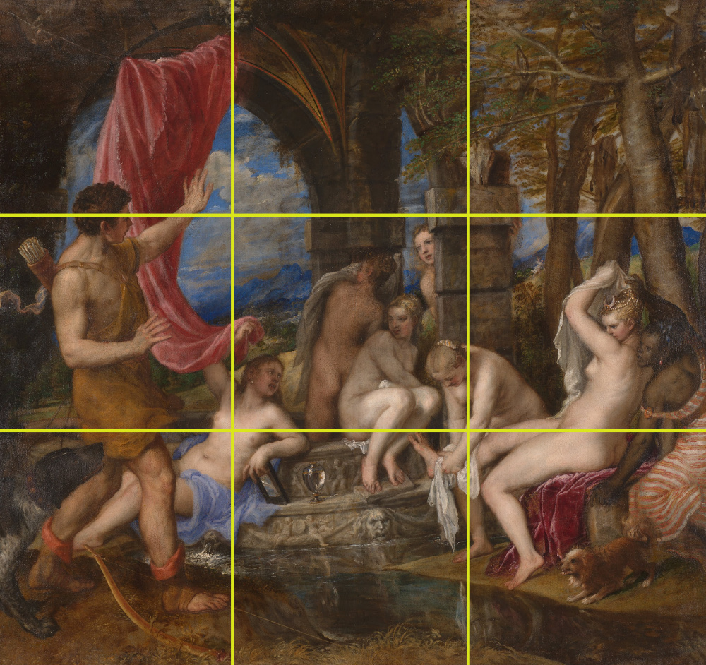
When I was in art class aged…10 I think, I remember my art teacher drawing a straight line down the centre of a sheet of paper. He said “How can we make this more interesting?” and we all sat there with no imagination or initiative, as usual. My engineering brain at the time thought that symmetry was good. “No,” he told us, and moved the line to a third the way across. “Now it’s more engaging, because your eye has somewhere to go. If the line is centred, your eye stays there. Off to the side, your eye starts to wander into the “free” space”. He went on to explain the origin of this with the Renaissance painters who used the Rule of Thirds to create a story. Here is an example, Diana and Actaeon by Titian. If you are interested, you can find out lots more, just search for “Rule of Thirds”.

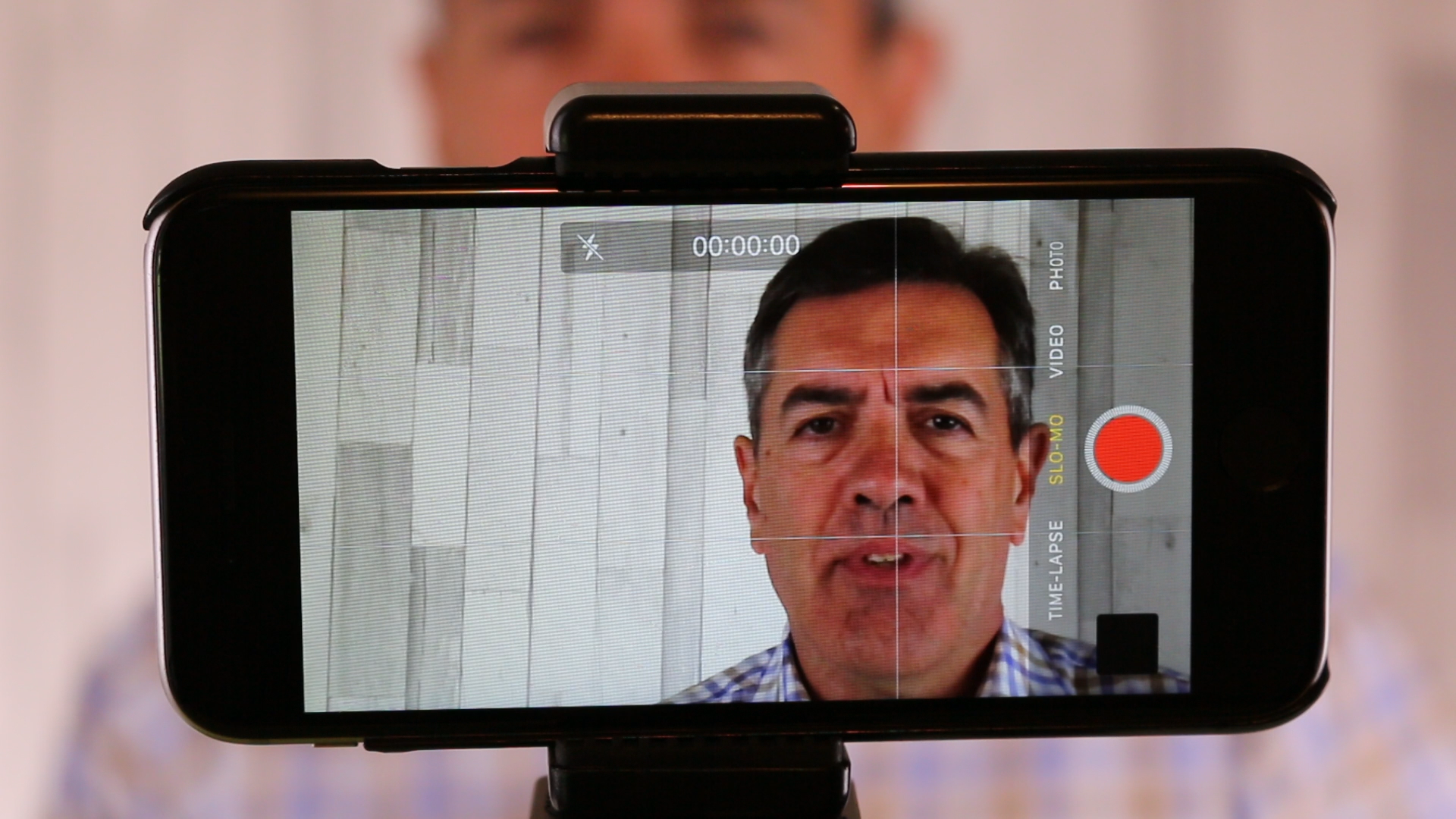
Back to video: on your camera or smartphone you will have a Grid setting in the viewing screen. If you switch this on, you will see the screen divided up into nine boxes. This divides the image into thirds, vertically and horizontally. To create a “story” with an image, place your subject at one of the intersections which will be the primary focal point. This triggers more interest for the viewer even in a simple talking head like this.

There’s more – you can create a Counterpoint. The secondary focal point is one of the other intersections, usually the one diagonally opposite. Even in a static image, this creates movement, interest and a potential story.
However, rules are there to be broken, but if you don’t know the rules how can you break them? This and more is covered in our one-day course “How to create awesome marketing videos – with your phone!” run by Martine van Woudenberg, sports video journalist and Neville Merritt.
Neville Merritt
